Personalization
How to Choose a Star Map Size and Frame for Your Wall
Choose a star map size and frame by measuring the wall, planning the viewing role, comparing current formats, and protecting the finished paper artwork.
Published July 18, 2026
Map Our Stars Editorial Team
The guide in a minute
Generated from this published guide. Read the full article for examples, context, caveats, and source notes.
This guide treats size and framing as a room-planning decision rather than a style guess. It explains the current Map Our Stars formats, a paper-template measuring method, frame-selection tradeoffs, and cautious display care.
- Mark the proposed print footprint on the wall before ordering, then judge it from the normal viewing distance and alongside nearby furniture.
- Choose print-only for recipient flexibility, or select black, natural wood tone, or antique brass by deciding whether the frame should recede, repeat a room material, or create contrast.
On this pageStart With the Wall, Not a Product Thumbnail
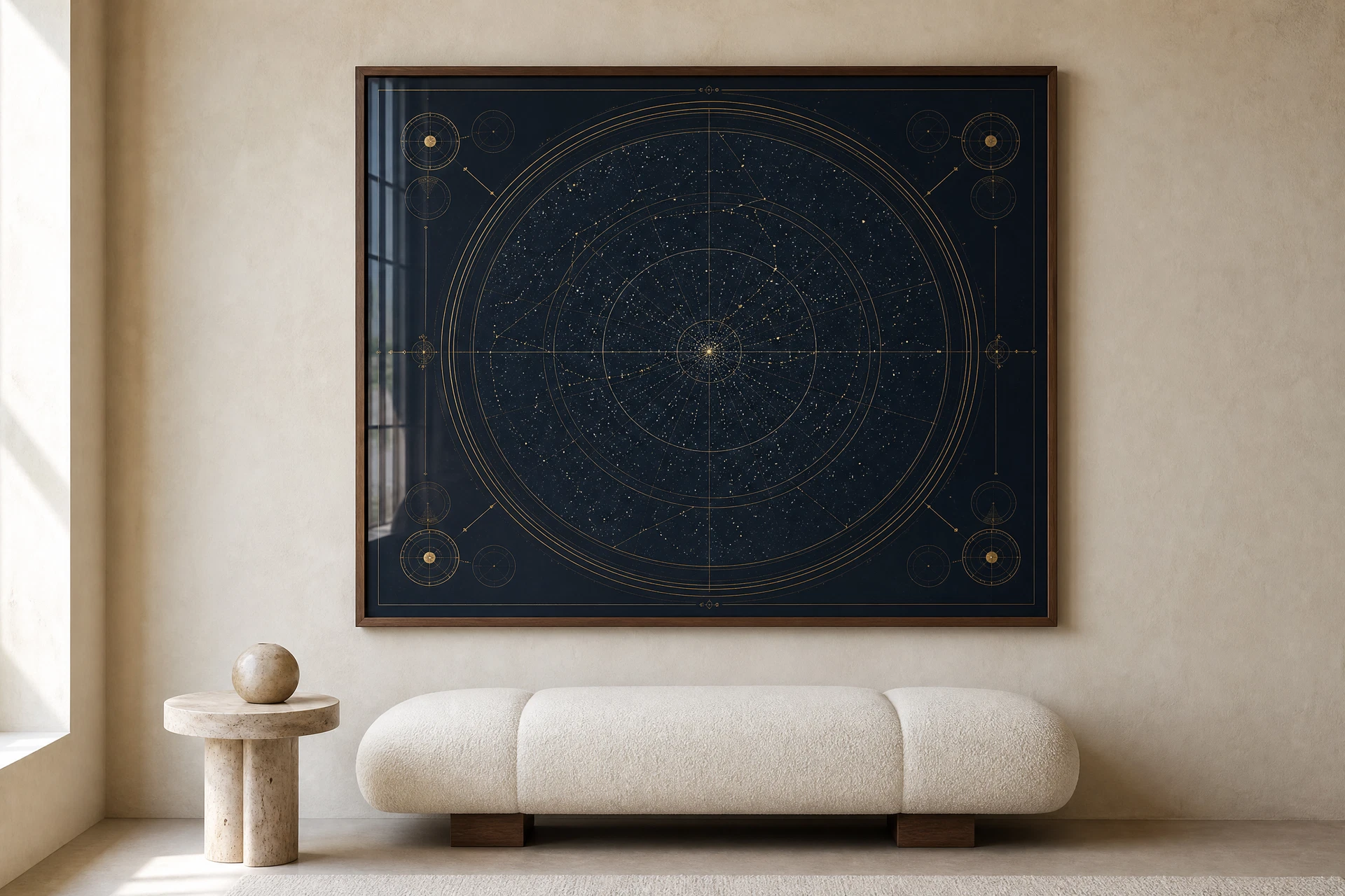
Quick answer: Choose the wall before you choose the frame. Measure the available area, mark the proposed print dimensions with low-tack paper or removable painter's tape, and look at the outline from the place where the artwork will normally be seen. Then decide whether the frame should blend with the room, repeat an existing material, or create deliberate contrast.
A personalized star map can be emotionally specific and still feel out of place if its scale is guessed. The practical question is not simply “Which size is best?” It is “What job should this artwork do on this wall?” A piece for a narrow reading corner has a different role from one intended to anchor a living-room console.
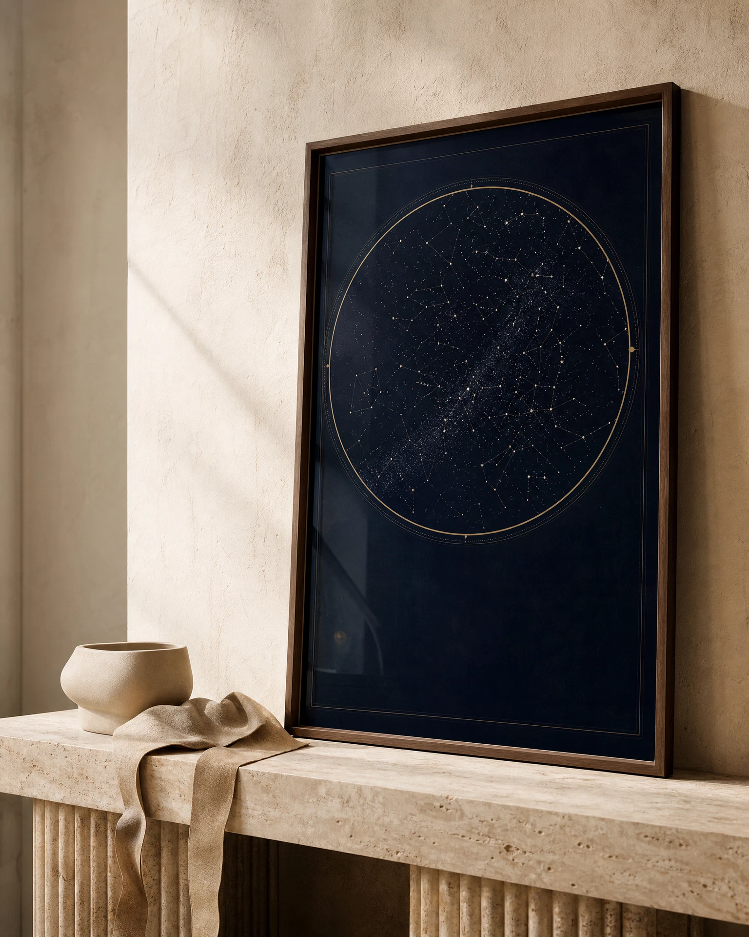
Map Our Stars currently offers three print dimensions—12 × 16 in, 18 × 24 in, and 24 × 36 in—with print-only, midnight black, natural wood tone, and antique brass presentation choices. This guide explains how to compare those real options without pretending there is one correct size or frame for every home.
Start With the Wall, Not a Product Thumbnail
Online previews are useful for color and composition, but they cannot tell you how large an artwork will feel in a particular room. Make the decision at full scale.
- Measure the usable wall width and height, excluding switches, vents, shelves, lamps, and doors that need clearance.
- Note the width of any furniture below the artwork and the normal viewing position.
- Cut or fold plain paper to the proposed print dimensions, or mark the outline with a removable material that is safe for the wall finish.
- Step back to the usual viewing distance. Check whether the outline feels lost, balanced, or dominant.
- Photograph the mock-up straight on. A photograph often makes uneven spacing or an unexpectedly small footprint easier to notice.
The listed size describes the print. A finished framed piece may occupy more wall area because the frame profile and any surrounding treatment add to the outside dimensions. Confirm the finished dimensions shown during selection or with support before relying on a tight recess or exact gallery-wall gap.
Compare the Three Current Star Map Sizes
Use these descriptions as planning prompts rather than universal decorating rules.
| Print size | A useful role | Check before choosing | Aspect relationship |
|---|---|---|---|
| 12 × 16 in | A focused piece for a smaller wall section, shelf-adjacent display, or compact gift | Will the dedication remain comfortable to read from the intended distance? | 3:4 |
| 18 × 24 in | A more visible standalone piece or the larger member of a gallery arrangement | Does the wall have enough quiet space around the artwork? | 3:4 |
| 24 × 36 in | A statement-scale piece intended to carry a larger wall area | Have you mocked up the full footprint and checked delivery access and hanging location? | 2:3 |
The change in aspect ratio matters. The 12 × 16 and 18 × 24 formats share a 3:4 relationship; 24 × 36 uses 2:3. Do not assume one frame can be reused across those formats, and do not crop or trim a finished personalized print to force it into a different opening.
When 12 × 16 in Is the Better Choice
Choose the smaller format when placement flexibility matters more than room-scale impact. It can suit a gift recipient whose exact wall plan is unknown, a narrow wall between openings, or a composition that will sit near other framed pieces.
Small does not automatically mean subtle. A high-contrast palette and dark frame can still command attention. Mock up the size with the dedication included, because text that looks generous in a screen preview will be read at physical scale on the wall.
When 18 × 24 in Is the Better Choice
The middle format can work when the piece should read clearly as wall art without becoming the room's largest object. It offers more visual presence than 12 × 16 while remaining easier to place than 24 × 36 in many rooms.
Test it above the actual furniture rather than applying a fixed percentage rule. Furniture proportions, ceiling height, lamps, plants, and neighboring art all change the available visual space.
When 24 × 36 in Is the Better Choice
The largest current format is most appropriate when you have verified the wall and want the celestial composition to be a primary visual element. It is less forgiving of guessed measurements, narrow stairways, or a future move to a smaller room.
Use a full-size template and leave it in place for a day. View it in daylight and after the room's evening lights are on. If the outline crowds nearby objects or dominates a low-ceilinged space, choose the middle format rather than relying on the frame color to make it recede.
Choose Print-Only or a Framed Presentation
The presentation decision affects flexibility, visual weight, and who is responsible for final framing.
| Current option | What it can do | Tradeoff to consider |
|---|---|---|
| Print only | Lets the recipient or a local framer choose the final presentation | The print needs safe handling and a correctly sized frame before display |
| Midnight black | Creates a crisp edge and can repeat other dark details in the room | Strong contrast may feel visually heavier on a pale or delicate wall |
| Natural wood tone | Repeats warm wood furniture and softens the transition from art to wall | Wood tones in one room do not need to match exactly, but clashing undertones can distract |
| Antique brass | Echoes warm metal accents and gives the artwork a more decorative boundary | A metallic direction is more specific and may be harder to place when the recipient's room is unknown |
Frame names describe the available visual direction; screens and room lighting can change how colors appear. Compare the builder preview, the intended wall color, and nearby materials before ordering.
A Three-Question Frame Decision
1. Should the frame recede or be noticed?
A frame that is close in value to surrounding objects tends to feel quieter. A frame with strong light-dark or warm-cool contrast becomes part of the composition. Neither approach is inherently better.
2. Is there a material worth repeating?
Look for a material that already appears at least twice: black window trim and lamp bases, warm wood shelving and a table, or brass hardware and lighting. Repeating that direction can make the new piece feel intentional without trying to match every finish exactly.
3. Is the recipient's room known?
If you cannot verify the wall, furniture, or preferred metals, print-only can preserve choice. It also transfers the measuring and framing task to the recipient, so it is best when they enjoy making home-decor decisions. If the artwork needs to arrive ready for display, choose the most adaptable frame direction you can support with real knowledge of the room.
Matting and Custom Framing a Print-Only Piece
If you choose print-only, take the untrimmed artwork and its exact measurements to a reputable framer. Explain which text and artwork boundaries must remain visible. A mat can create visual breathing room, but its window should not cover the dedication, date, place, or outer design elements.
The Library of Congress notes that matting and framing can provide physical support and protection for works on paper, and it describes window mats, protective glazing, and stable backing as parts of a preservation-minded housing system [1]. That guidance does not guarantee the lifetime of a particular print or frame. It does support avoiding improvised direct attachment, pressure from an undersized opening, and materials of unknown suitability.
Do not use household tape or permanent adhesive directly on the artwork. If long-term preservation matters, ask the framer to explain the mounting method and whether it can be reversed without damaging the print.
Display the Finished Artwork With Care
Paper, inks, frame materials, room conditions, and cumulative light exposure all affect how an artwork changes over time. No placement can guarantee that a print will remain unchanged.
The U.S. National Archives advises protecting family papers from light exposure, moisture, pests, and extreme storage environments [2]. For displayed paper art, choose a stable interior wall away from persistent direct sunlight, radiators, vents, and damp areas. Use hanging hardware appropriate for the wall construction and the finished framed weight; when in doubt, ask a qualified installer.
Glazing can provide a physical barrier, but this guide does not assume which glazing material is included with any particular order. Confirm current product specifications before relying on a framing component for a specific protective property.
Four Common Scenarios
You Are Building a Gallery Wall
Start with the full outer dimensions of every framed piece, not only the image openings. Lay the arrangement on the floor or reproduce it with paper templates. Keep the gaps deliberate and check that the star map's dedication remains readable rather than becoming a small text block among busier images.
You Want One Piece Above a Console or Bed
Measure the furniture and test both the middle and large formats at full scale. Centering is not the only option, but any offset should relate to a lamp, plant, or neighboring object rather than look accidental. Keep installation safety and the wall construction in mind, especially above a bed.
You Are Giving the Artwork Without Seeing the Room
Choose 12 × 16 or print-only only if those tradeoffs suit the recipient; do not treat either as a universal safe choice. You can also ask for a wall photo and approximate dimensions without revealing the full gift. A framed option reduces the recipient's work, while print-only preserves their control.
You Are Marking a Major Anniversary or Wedding
The emotional importance of the occasion does not require the largest size. Choose the format that fits the home, then use the date, place, and dedication to carry the meaning. If you are still selecting the relationship moment, read the guide to choosing the date, time, and place for a personalized star map. For concise wording, use the moment + meaning + detail framework.
Before You Order: A Measured Checklist
| Check | Question |
|---|---|
| [ ] | Did you measure the usable wall area and the nearby furniture? |
| [ ] | Did you mark the proposed print dimensions at full scale? |
| [ ] | Did you view the template from the normal seat, doorway, or walking path? |
| [ ] | Did you account for the framed piece being larger than the listed print dimensions? |
| [ ] | Did you decide whether the frame should recede, repeat a material, or contrast? |
| [ ] | Did you verify names, date, time, place, and dedication? |
| [ ] | Did you review current production and shipping expectations? |
Once the wall plan is clear, open the personalized star map guide and builder. Compare the 12 × 16, 18 × 24, and 24 × 36 options with print-only, midnight black, natural wood tone, or antique brass presentation before checkout.
The right choice is the one you can explain in practical terms: this size fits this wall, this frame belongs with these materials, and this presentation gives the artwork the role we want it to have.
References
[1] Library of Congress, “Matting and Framing Works on Paper.” https://www.loc.gov/preservation/care/mat.html
[2] U.S. National Archives, “How to Preserve Family Archives.” https://www.archives.gov/preservation/family-archives